Elbows: Another look at the elbow method using first-order differences
By Paul Villanueva in bioinformatics
August 19, 2021
A common problem encountered in research is deciding how many components or clusters to use in your analysis. For example:
- How many components should you use after performing principal component analysis (or other dimension reduction techniques)?
- How many clusters should you use in a k-means clustering classification task?
- How many hidden layers and nodes should you use in a neural network?
If we use too few components/clusters/layers, then we are unable to accurately describe the behavior of our system. On the other hand, if we use too many components/clusters/layers, then the computational time may grow too much, making solving the problem intolerable.
Consider the following plot of abundance of genes by clusters.
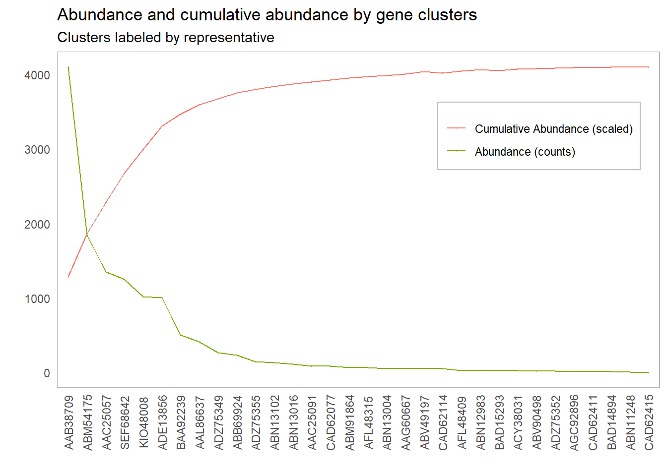
It’s clear we need to include the first couple of clusters so our probes will pick up a reasonable amount of our gene targets, but how many clusters should we include? Our intuition tells us to include the first 6 clusters, up to and including ADE13856. But why does our intuition tell us that this point is special? What is it about the curve at this point that draws our eyes to it?
What our intuition is picking up on is the point of the curve where the marginal benefit begins to flatten out. That is, the rate at which we gain benefit by adding another unit starts to significantly decrease past this point. One way to think about this analytically is to look at the rate of change in the benefit with respect to the number of clusters or components included. The meaning of benefit changes from context to context. In PCA, the benefit is the percentage of variance explained
Some other mentions of the elbow of a graph:
- Wikipedia states that the elbow “cannot always be unambiguously identified”.
- The University of Cincinatti shows a method for finding the elbow in the context of the k-means clustering algorithm.
- The most thorough answer I’ve found is Ben’s answer on Stack Overflow, which demonstrates several different methods for finding the elbow of a plot.
- The GMD and factoextra R packages provide methods for finding the elbow of a graph, though I wasn’t able to get the packages operational at the time of writing.
As seen above, there are several methods for analytically determing the elbow of the graph, but they are all somewhat computationally expensive and difficult to communicate. The method I’ve chosen to find the elbow of a graph is based on the first-order difference. The method is as follows:
- Let
\(f\colon X\to \mathbb{R}\)be some benefit function, and choose some\(t \in X\). - Calculate the first-order differences of
\(f\)on\([0, t]\)and on\([t, \sup{X}]\). That is,$$f_{t^-} = \frac{f(t) - f(0)}{t}$$and$$f_{t^+} = \frac{f(\sup{X}) - f(t)}{\sup{X} - t}$$. Note that this is just calculating the slope of the secant lines through\(t\)from either end of\(X\). - Assign a score to
\(fod_t\)to\(t\)via\(fod_t = f_{t^-} - f_{t^+}\). - Repeat this process for all choices
\(t \in X\). The elbow of\(f\)is the choice of\(t\)that maximizes\(fod\). That is, the elbow point is\(\arg \max fod_t\).
Less formally, we’re assigning a score to each cutoff point by separating the curve into two parts and calculating the difference in the average rates of change for both of these parts. We then choose our elbow point to be the cutoff point that maximizes this score. A simple R script for finding the first-order differences for each observation in a dataframe df might look like:
fo_difference <- function(pos){
  left <- (amoa.cluster_info[pos, 4] - amoa.cluster_info[1, 4]) / pos
  right <- (amoa.cluster_info[nrow(amoa.cluster_info), 4] - amoa.cluster_info[pos, 4]) / (nrow(amoa.cluster_info) - pos)
  return(left - right)
}
df$fo_diffs <- sapply(1:nrow(df), fo_difference)
Note that this calculation of the first-order differences on either side of the point assumes that the observations are equally spaced; that is, the distance between each observation is uniform. This is usually the case for these kind of problems, but this is an assumption you should check before using the above function. From here, we simply take the max of df$fo_diffs to find our elbow point.
As an example of this method, let’s look at the first-order differences for the plot above and see what cutoff point maximizes that difference:
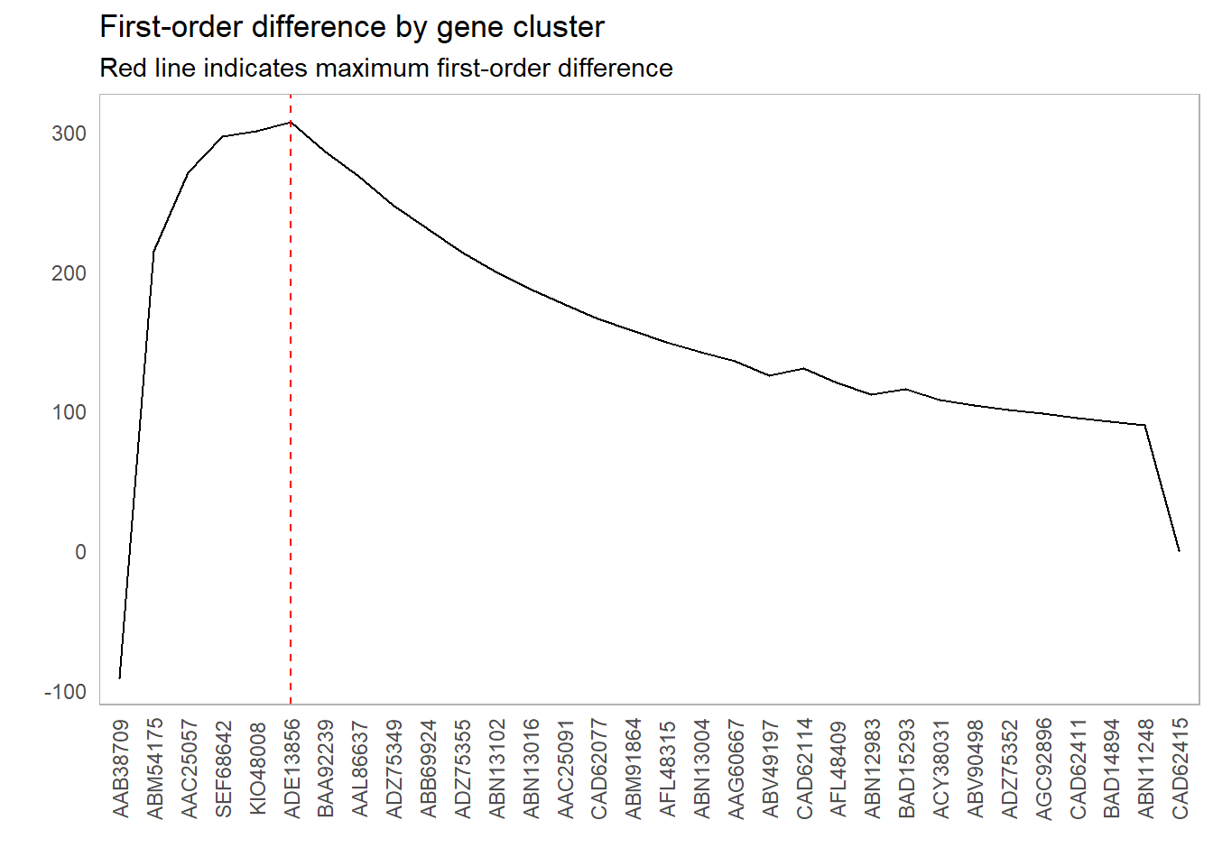
This lines up with our intuition as to which clusters we should include:
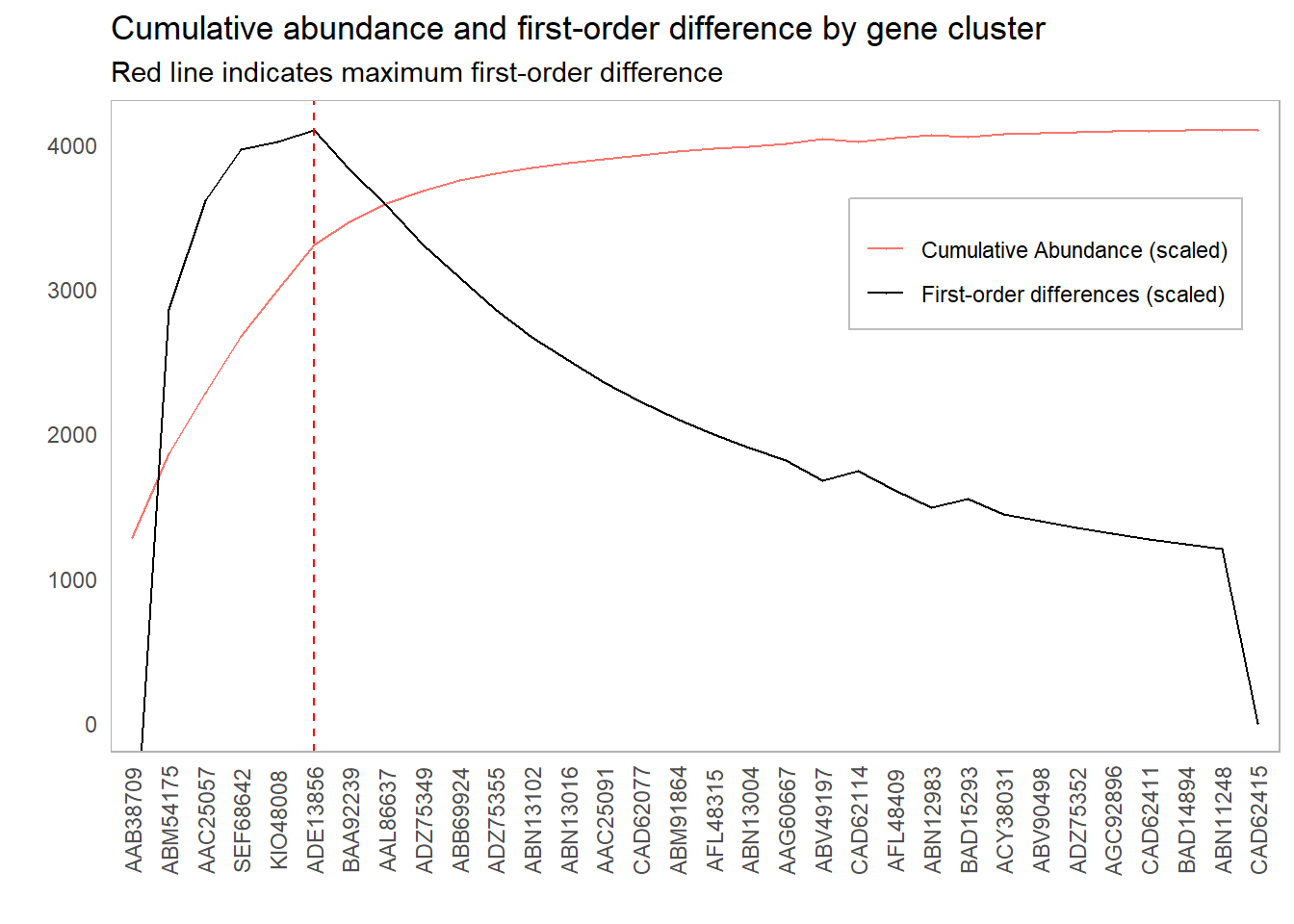
However, it might be worth investigating other inclusion thresholds around this elbow; if the scores around this point are sufficiently close, then we might have some additional information that will inform our cutoff choice. For instance, if there is a significant cost in adding more components, we might err for fewer components if the first-order difference is roughly the same. One suggestion could be to look at cutoffs whose first-order difference is within 10% of the elbow point:
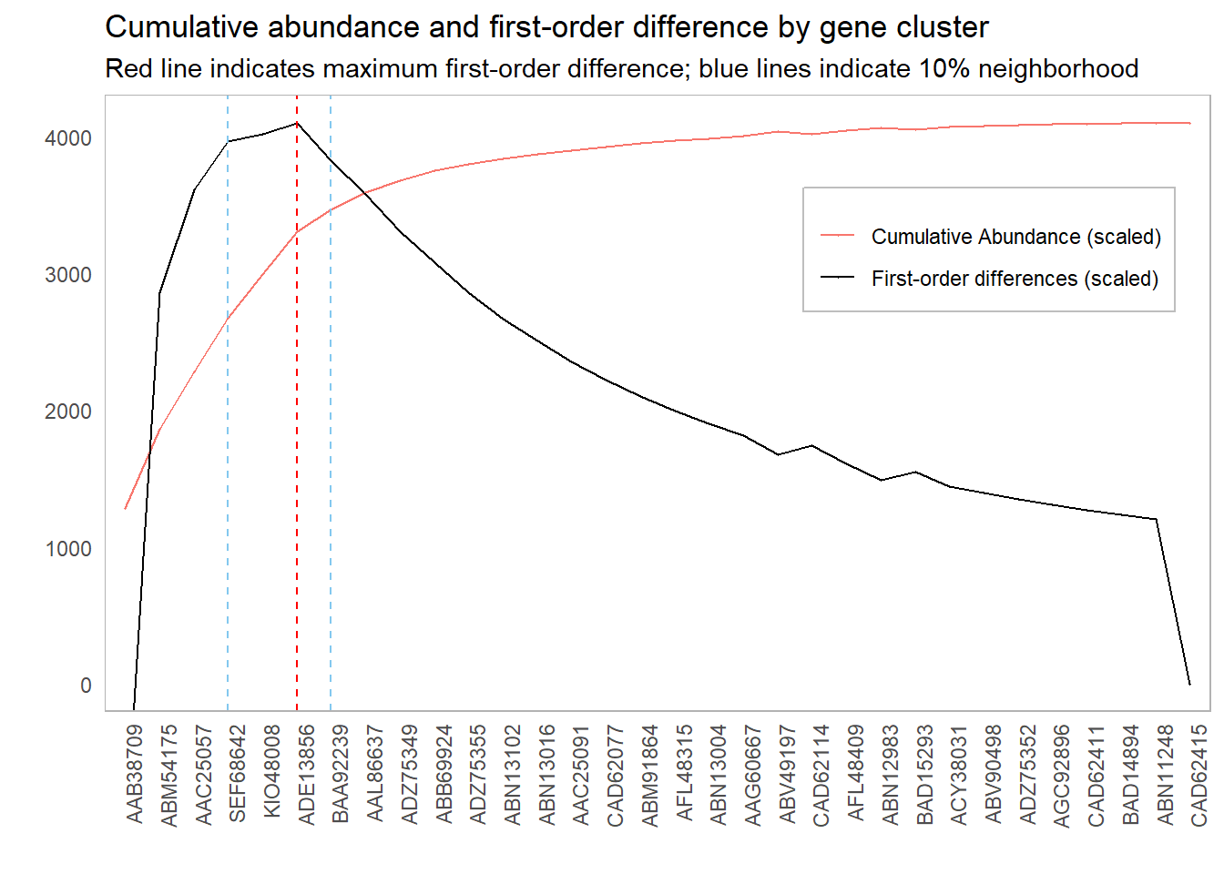
This 10% value was chosen completely arbitrarily. There are probably smarter ways to choose this cutoff. For instance, we could simulate “significant” first-order differences:
- Shuffle the order of the clusters
- Calculate the largest first-order difference
- Repeat (say) 1000 times
- Choose a 95% percent cutoff from these simulated values
Doing so will give us more cutoff values to investigate.